If you're on the fence about implementing SuccessFactors Workforce Analytics, there's a fairly good chance you don't know the scope of what you can achieve. Often even businesses that are using Workforce Analytics are often not getting the most from the module.
Dashboards are a major reason for that. The default dashboards are limited and far from best-practice from a data visualisation perspective.
But you don't need to stick to the default dashboards.
This is a myth-slash-misconception that's sprung up because many implementation partners don't configure dashboards as part of implementation. And most businesses don't have the time, skills or inclination to configure dashboards themselves (they just want the module to work. With minimum effort or disruption).
That's one of the major advantages of working with 3n Strategy. We've built a library of dashboard templates following data visualisation and decision-making best practices, to help customers get the most from Workforce Analytics easily. All 3n customers get a free template - customised to your needs - for free within our standard technical packages.
Below, we'll share five examples of dashboards you can create using SuccessFactors Workforce Analytics. They're all using SuccessFactors demo data associated with Metrics Packs possible on WFA-on-HANA (if that sounds confusing, here's an FAQ...) but they're a great starting point, to give you a sense of what's possible for you.
Seeing value from Workforce Analytics means taking that crucial step from gathering data to making data useful for decision-making. An engaging, compelling dashboard is valuable because it's how you make data accessible and useful instead of overwhelming.
According to The HR Analytics ThinkTank, people analytics functions that had access to better than average visualisation tools were 3x more likely to feel their use of HR analytics was ‘strategic’
Here's what that might look like. (Or skip to this short video showing these dashboards in action).
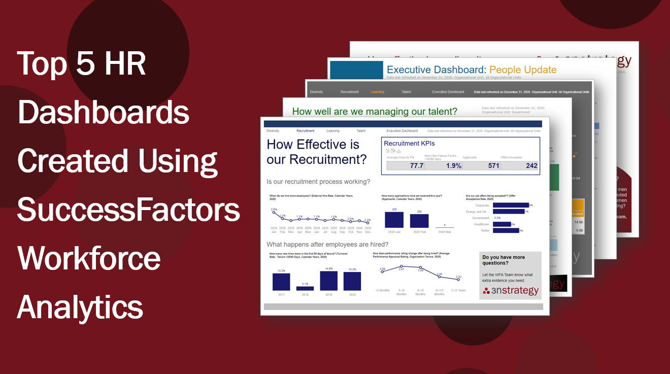
Our Top 5 HR Dashboards for SuccessFactors Workforce Analytics
1. HR Dashboard for Diversity
Here's an example of a Diversity Dashboard using SuccessFactors Workforce Analytics. It's designed to empower HR leaders to track whether the company has a diversity problem, where that diversity problem could stem from and whether their diversity programme is having a positive impact.
The questions you include are totally customisable so you only see what's most relevant. In the example below, the dashboard asks:
- Do we have a gender imbalance?
- Are there areas in the business where this imbalance is worse?
- Is attrition driving the imbalance?
- Do women leave for different reasons to men?
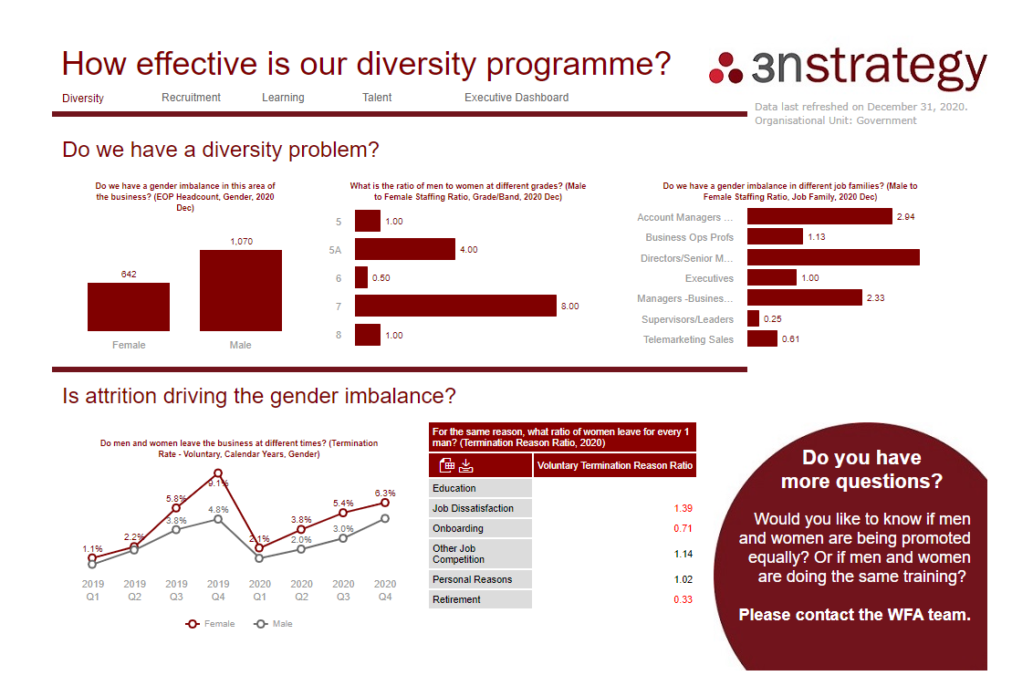
Example HR Dashboard for Diversity using SuccessFactors WorkForce Analytics
You'll notice in all these example Workforce Analytics dashboards, they're designed to tell a narrative - not just sharing endless data. So they're inherently more useful for business users, to accelerate adoption.
2. HR Dashboard for Recruitment
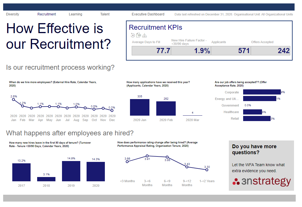
This is an example of a SuccessFactors Workforce Analytics dashboard that pulls data from the SuccessFactors Recruitment module, to support recruitment decision-making. This example dashboard has three sections:
- KPIs. In the top layer, we've set up a section to track recruitment KPIs like days-to-fill and new hire failure factor. You could pull any KPIs into this section depending on what's most relevant to you, so your business users aren't overwhelmed with irrelevant data.
- Operational/HR Process Metrics. The middle layer of the dashboard shows recruitment leaders how well the recruitment process is going. Again, you could add whichever metrics make most sense for you - we'll help you understand what'll suit you best if you're not certain.
- Strategic Metrics. We've set-up the bottom layer to show HR and business leaders how recruitment practices impact overall people strategy. This section could be invaluable in linking recruitment value to business value, for example.
Example HR Dashboard for Recruitment using SuccessFactors WorkForce Analytics
3. HR Dashboard for Learning and Development
We designed this SuccessFactors Workforce Analytics dashboard to help L&D leaders understand whether their training strategy is effective and how training is consumed across the business. You could add KPIs too, for example, and pull in strategic metrics to show how training impacts business outcomes.
The idea is, with a useful dashboard like this, L&D leaders can then decide evidence-based next-steps for their function to maximise positive learning - and business - outcomes.
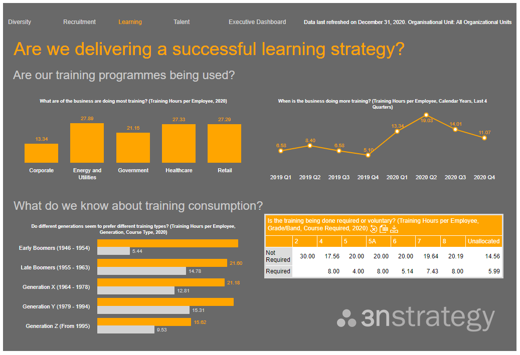
Example HR Dashboard for L&D using SuccessFactors WorkForce Analytics
This colour combination is always popular when we run demos but the look-and-feel of these dashboards is completely customisable. So for example, you could integrate your brand colour palates, to create a Workforce Analytics experience that's consistent with your other enterprise tools.
Equally, the way you display data is completely customisable too, whether that's columns, bar charts, line graphs or just a table. (And we'll work with you during implementation to suggest best-fit visualisation if you don't have strong preferences).
4. HR Dashboard for Talent Management on SuccessFactors Workforce Analytics
This is an example SuccessFactors Workforce Analytics dashboard for Talent Management. Here we pulled in Employee Central mobility data (read about Metrics Packs in our SuccessFactors Workforce Analytics FAQ) combined with salary data, performance data and diversity data, to show HR leaders and talent managers how they're managing High Performers versus the overall workforce.
Those leaders then have the evidence to understand how the business empowers different employees, and whether they could make better decisions to elevate performance.
This tactic of combining data from several SuccessFactors modules is how you start to really add value for business users, by creating a multi-faceted narrative that brings the evidence 'story' to life.
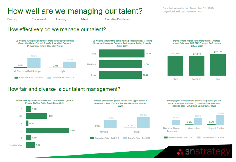
Example HR Dashboard for Talent Management using SuccessFactors WorkForce Analytics
5. HR Dashboard for HR Executives
This is an example of a SuccessFactors Workforce Analytics dashboard you could create for HR Executives, inspired by the SAP Analytics Cloud (SAC) HR dashboard.
Executive decision-making typically needs a high-level view of certain HR hotspots, commonly looked at in the context of business risk. So that's what this dashboard interrogates, giving some examples of short-term operational risks alongside long-term strategic risks. (Identifying what constitutes risk for your business is always a major focus of our Workforce Analytics Strategy Sessions, for example).
Armed with a dashboard like this, HR Executives could make smarter, evidence-based decisions about the HR function, to pre-empt issues and protect against business risk.
We've kept this example dashboard clean and simple, so the at-a-glance usefulness factor is high. That's especially important for executives who typically won't access dashboards themselves. You can also use the Export to Powerpoint tool so data's easier to present if that's how your business works best.
You'd then lead more detailed pages off from this, so decision-makers can drill into the data further if they need to. You're aiming for a streamlined, clean feel but with powerful, complex data interrogation happening under the hood.
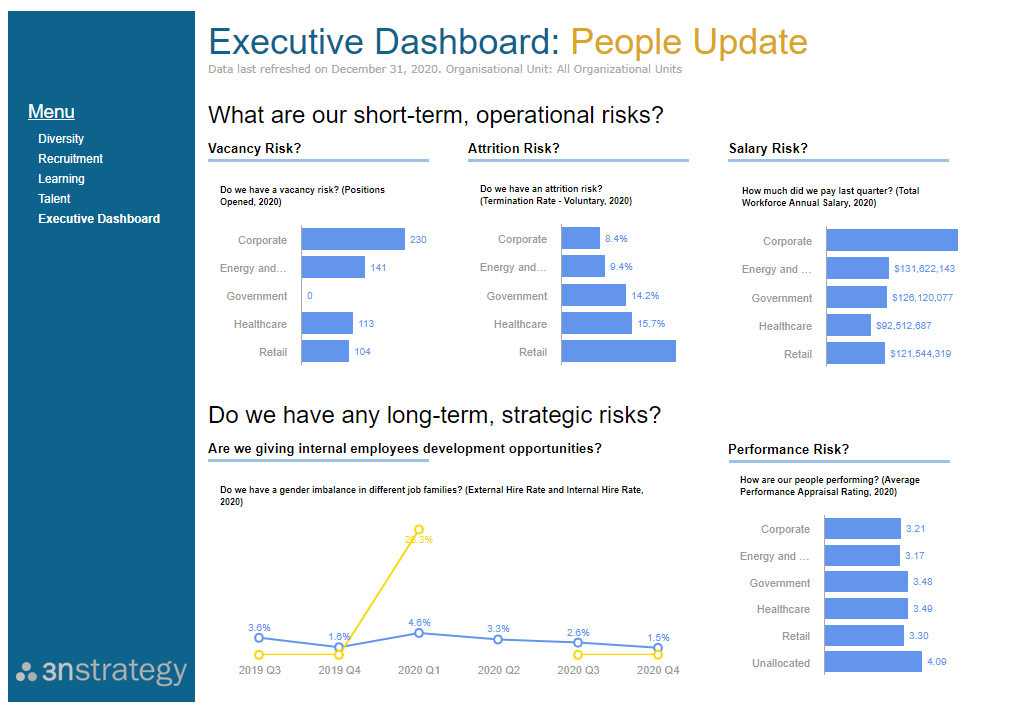
Example HR Dashboard for HR Executives using SuccessFactors WorkForce Analytics
SuccessFactors Workforce Analytics Dashboards IN ACTION VIDEO
Here's a short video skimming through these dashboards in action on the SuccessFactors Workforce Analytics tool:
Four principles to create more useful SuccessFactors Workforce Analytics dashboards
Typically, businesses don't want to handle these things solo. Setting up dashboards can be time-consuming and complex, and most people we chat to just want Workforce Analytics to work. With as little hassle as possible. That's where 3n Strategy comes in.
If you do want to play around with dashboards yourself though, these are four principles that'll help your dashboards be engaging, compelling and useful:
- Context. Think about the context your user will be using the dashboard in, to make sure the data you include is relevant to their needs. For example, you could create a dashboard examining 20 KPIs around graduate recruitment - but if you're not currently making decisions around graduate recruitment, those KPIs aren't relevant. (We use 3n Strategy's HR Decision-Makers Library to decide which data is relevant).
- Narrative. Think about how you can storyboard questions and decisions, to create a story rather than standalone, ad-hoc questions. Stories are how humans process.
- Experience. Think about the experience your end user will find most useful. Do they need lots of access and flexibility? Or a static, prescribed experience?
- Design. Think about what your dashboards and reports need to look like, to be maximally engaging and accessible for everyone.
If you're thinking about implementing SuccessFactors Workforce Analytics - or you already have, and your dashboards are holding you back - get in touch and let's chat about how 3n Strategy could help. 

.png?width=2433&height=555&name=3n%20Strategy%20PNG%20Logo%20(Transparent).png)




-1.png)
